Learning to see quality
I strongly remember, several times in my childhood, playing a videogame and thinking, "wow, this looks just like reality. This is as good as games visuals are going to get!"
Usually it was something that, today, looks like ass. Like Jedi Knight: Jedi Academy:
Of course, I can see now that this does not look at all "like reality." It is extremely easy to point out the several ways in which Luke Skywalker's face and body looks bad or animates like a puppet. But when I was younger, it was pretty easy for me to look at this stuff and think, "wow, visuals don't need to get any better. This is great."
I am pretty sure I also thought the same thing about Assassin's Creed 2, which now has a lot of very clear XBox 360 visual hallmarks that mark it as stylized, low-fidelity, etc:
But despite having been proven wrong several times before, I still routinely play new big-budget games on my PS5 and think, "oh wow, this is as good as I need graphics to be. This is almost too devoted to realism. I need a break from this insistent realism!"
Having worked in games for many years, I can now recognize this foolish belief as, like, my taste and tolerance accepting a stylization which wears the crown of realism, so to speak. It is a visual style which gets to claim "damn, don't I look realistic?" in marketing materials only because it is dripping with money.
I now know that every game production has art direction, and that "looking like real life" isn't precisely the goal of any of these games. Real life has infinite levels of detail - grab a microscope and you can find them - but games have to choose their density of detail. They have to choose which visual problems to solve, and where to spend their money, and they have to present environments which are easier to read and analyze visually than environments in real life are. But because some of these games choose to be very high-detail, and because they spend lot more money than some of their competitors, they get to wear that "realism" crown in marketing, and I still sometimes find myself accepting that claim to the throne.
This past week, I have been ripping a lot of my DVD collection to my computer so that I can put it on a Plex server rather than fussing with discs. I have all my old favorite movies from childhood and college on DVD or Blu-ray, and it's been a total shock to see the image quality the DVDs have.
It's bad!!! I didn't expect it to be so bad! The last time I put these DVDs in a player, they looked good to me!!
That's terrifying!! It's like a brain worm colonized my brain and made me think my favorite movie is ugly!! What!!!!
For reasons I will discuss, it is very difficult to effectively communicate to you, the reader, how weird this movie looks now that it is ripped off a DVD onto my modern monitor. But here's a screencap from my treasured copy of Master and Commander:

If you're looking at this post on a desktop monitor, you'll probably see something like what I see: blurry figures, and a weird visual artifact around the border that I don't fully understand myself. A compression artifact?? A bad transfer from the film???

When I was a kid, though, I used to watch this footage on a low-resolution flat-screen television - probably an LCD? I'm not certain, but that may have been the technology we replaced our CRT TV with. As far as I know, the DVD I was watching back then was the same quality as the one I have here on my computer today - probably the exact same data.
So, it's worth assuming that I used to look at this precise image and think, "Wow! Incredible quality!!! Nobody will ever need anything better! Captain Jack Aubrey and Stephen Maturin are rendered in such incredible detail here in my living room!!" The only difference is the hardware.
Anyway, if you're reading this on a phone, you're probably painfully aware that the visual quality I'm trying to communicate with these screenshots is coming across completely differently for you because of your hardware, too. You might not even be able to see the weird artifacting around the edge of Master and Commander. There are so many different kinds of screens now, and even the worst ones have way more resolution than was even possible on TVs back when I was a kid. And software has a say, too... I don't know everything about how CSS resizes images, or how Chrome plays a part.
So: none of you are seeing this image the same way I do, because I'm watching it on a very particular monitor, and it hasn't been resized on my computer, and I haven't tested this post at all on a phone. We can't really see the same thing at all here, can we? Well, we can pretend.
So part of the reason this movie looks weird to me is my hardware. And part of the reason this movie looks weird is that I have been habituated to seeing modern videogames and Blu-rays, I've seen those things wearing the money crown, and this transfer of Master and Commander looks impossibly old to me now, so it can't wear the crown anymore.
I'm not a tech artist or even a regular artist, so I'm just left up alone at night transferring all my DVDs and wondering: what part of the weirdness I'm seeing is the hardware? What part is some dumb fucking worm I got in my brain that habituated me to a different level of fidelity? If I watched this on an old TV, how would it feel to me? Would it look normal again? I am sure someone knows the answer to that, but I don't.
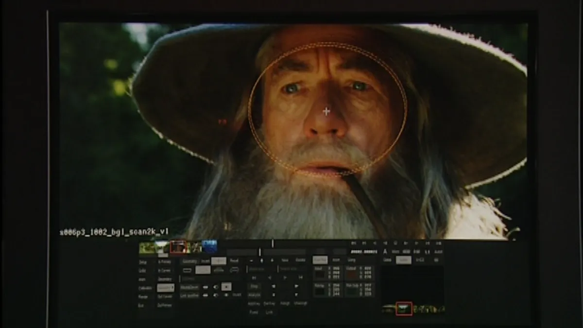
I also now have the Special Extended Edition of The Fellowship of the Ring on my computer, and it looks even muddier. The special features look fucking wild on my monitor. Maybe they'll look wild on yours? It all depends whether you're on desktop or phone:
Anyway, I'm not invested enough in this question to go out and get an ancient old LCD television and watch Master and Commander on it.
(I am, however, invested enough in this question to buy the second printing of that Blu-ray that sold out a few weeks ago...)